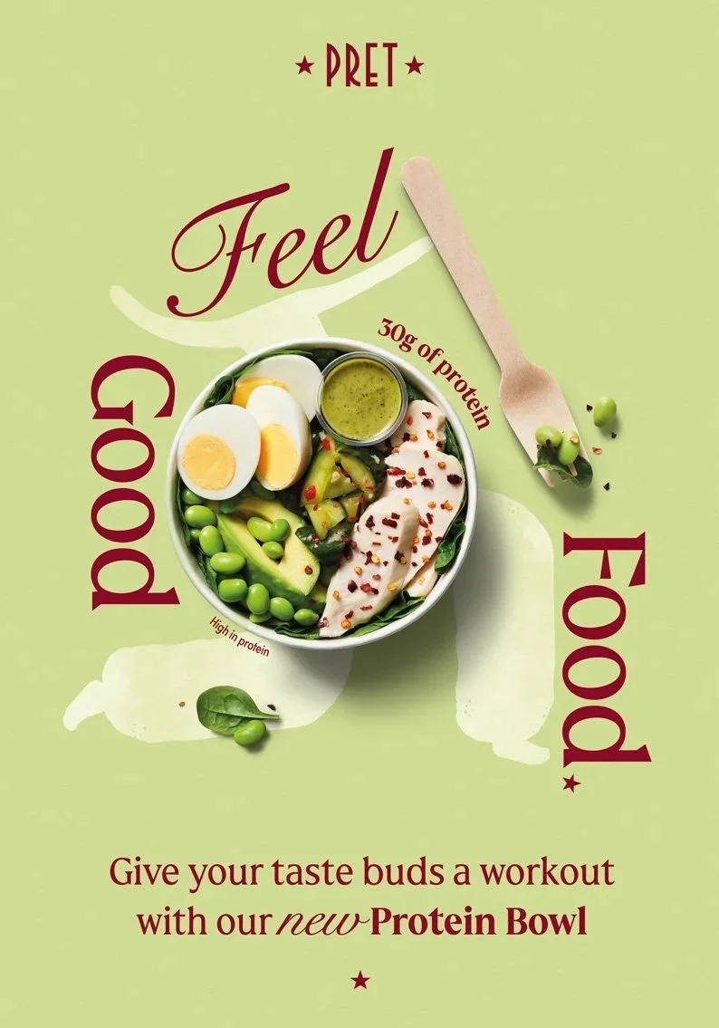
PRET A MANGER
Illustration, photography and digital rollout
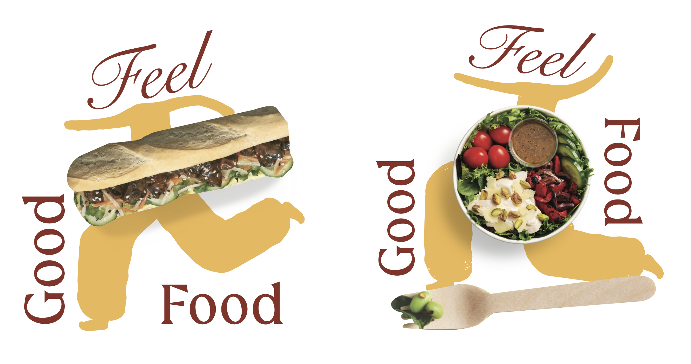
A national Pret A Manger campaign built around real food, bright colour and feel-good energy.
I worked throughout the process, from illustration and digital design, to animation and art direction, helping to shape a campaign world that felt fresh, flexible and unmistakably Pret.
MY ROLE
————————
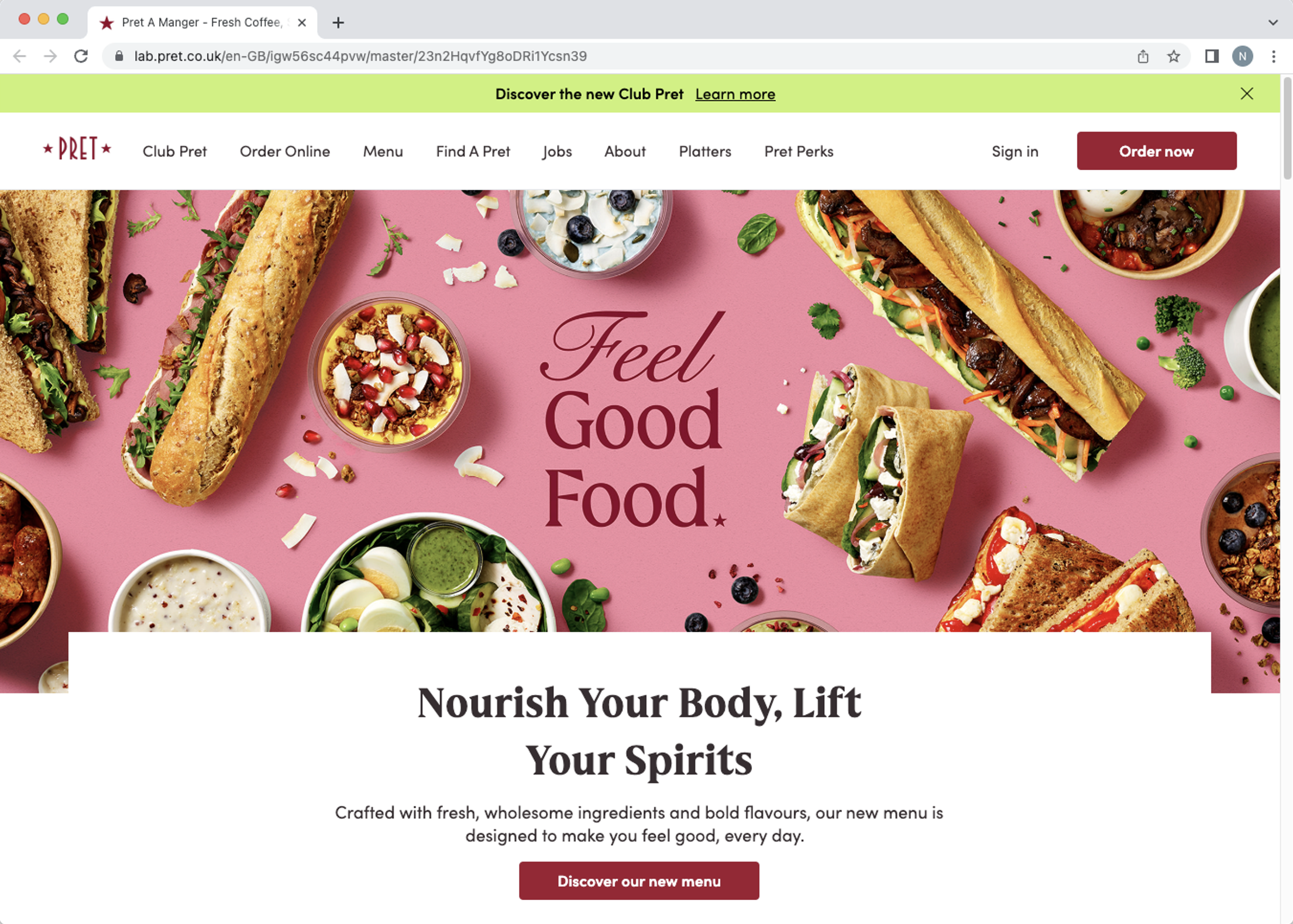
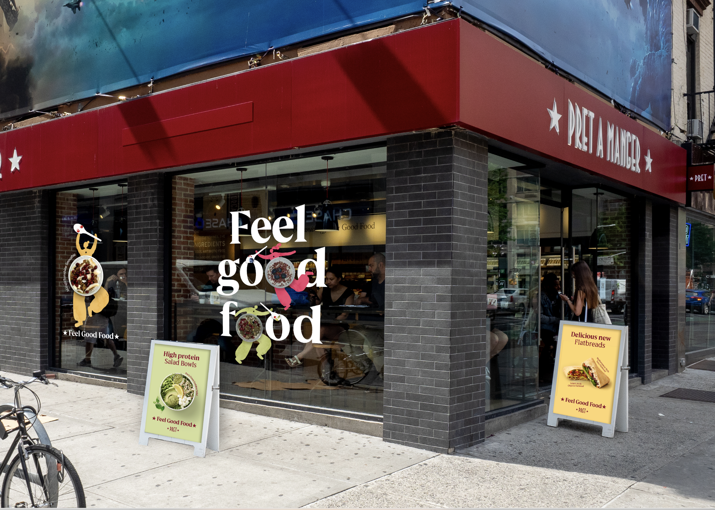
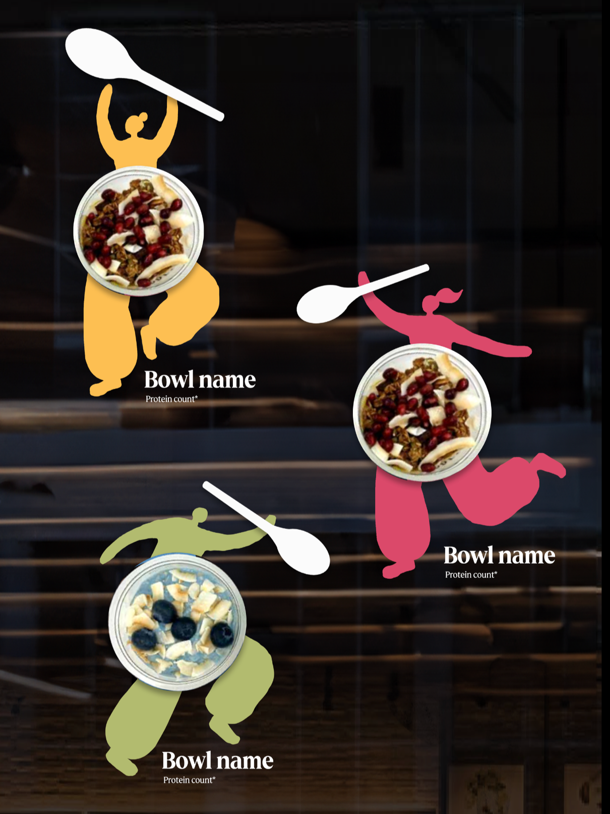
I led the digital side of the campaign from concept to delivery, while also developing the illustrated characters used across the wider campaign.
This included character concept development (see directly below), typographic lockups, shoot planning, product art direction and rollout of CRM, paid social, animation and digital assets.

CHALLENGES
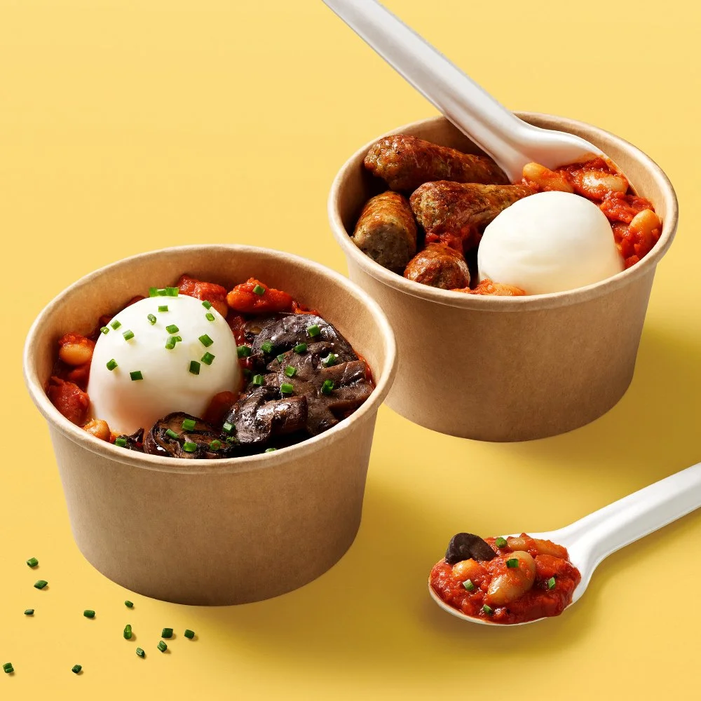
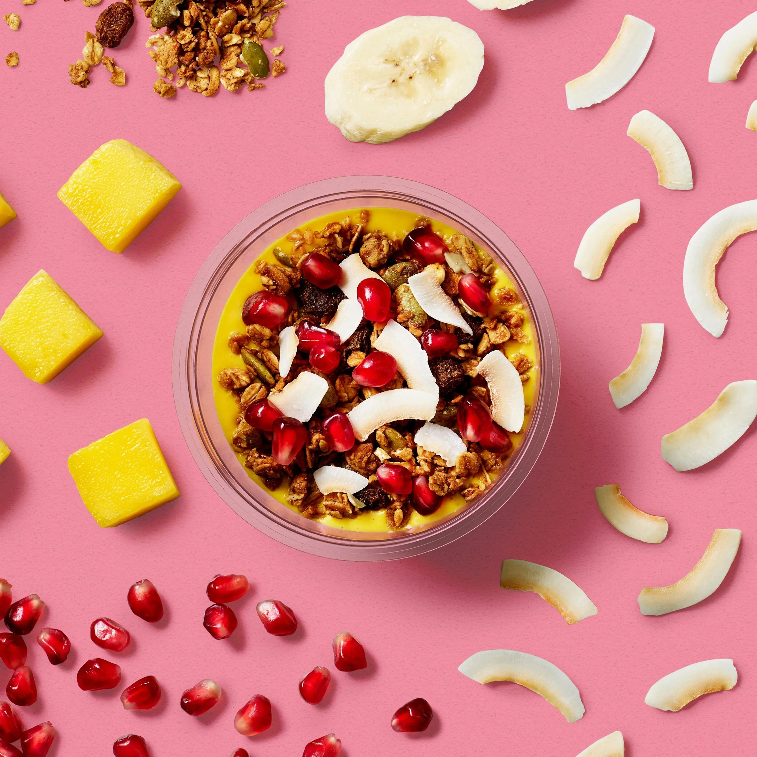
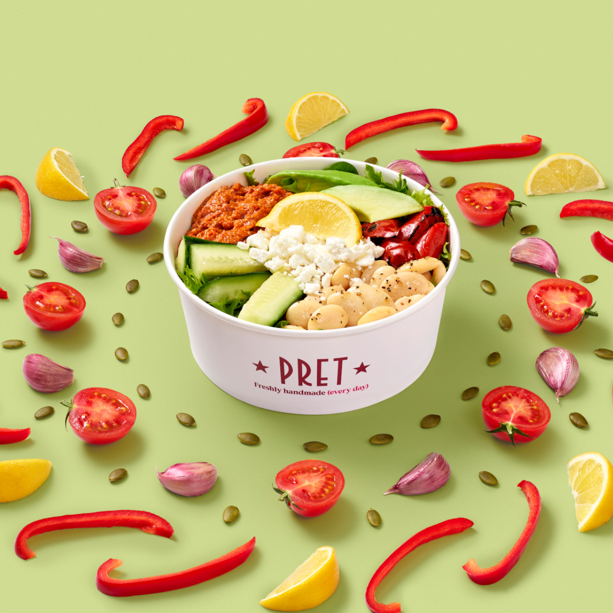
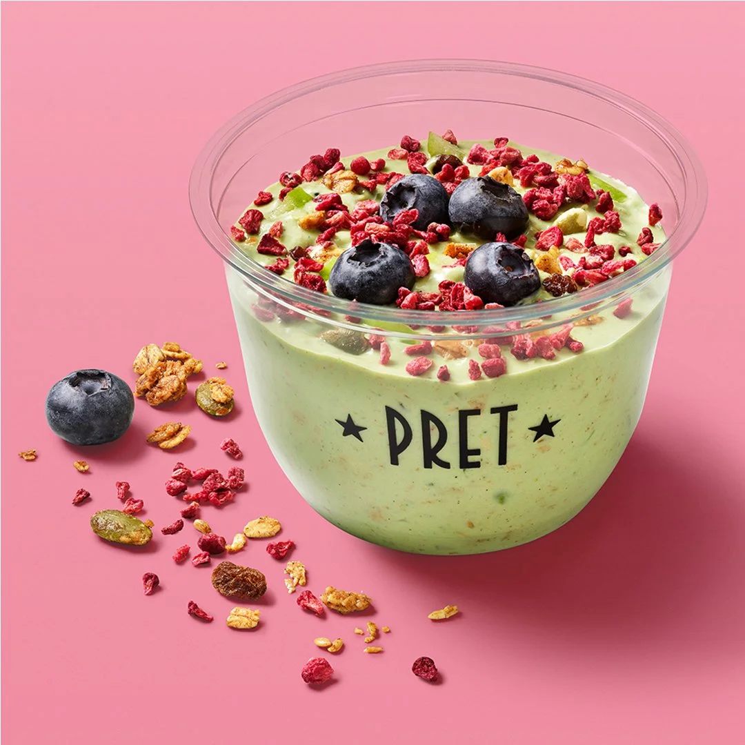
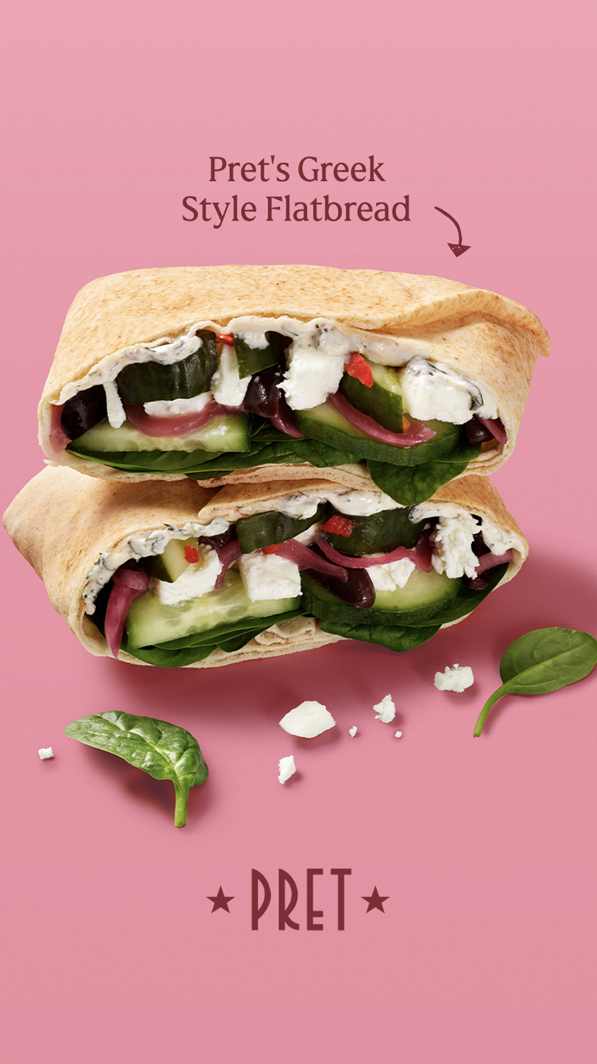
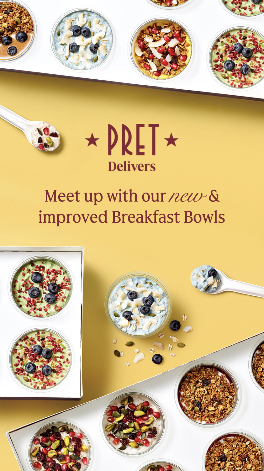
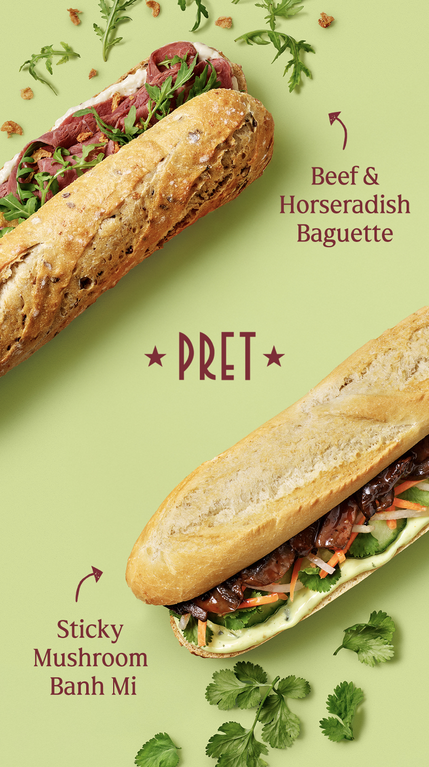
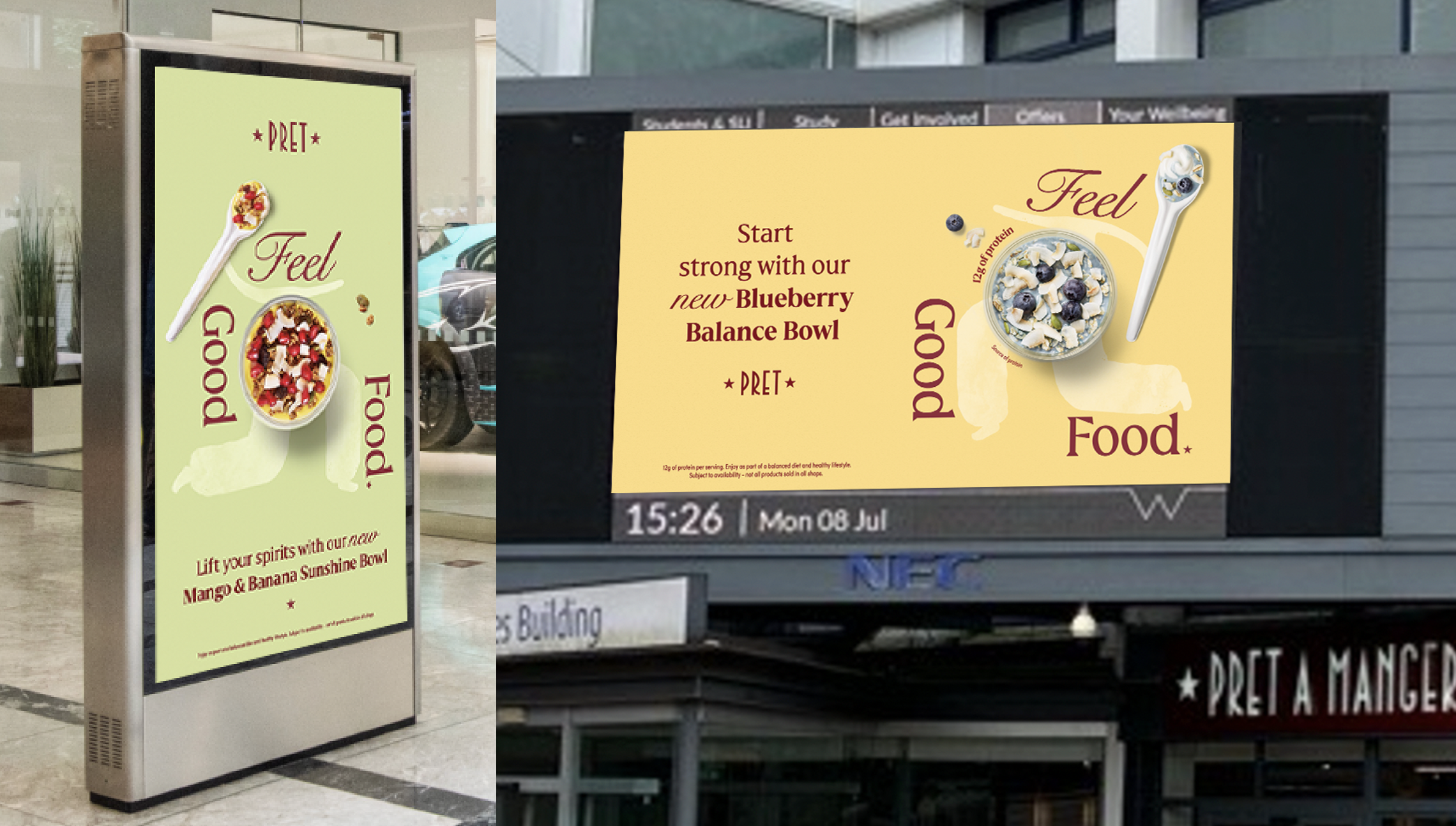
The campaign needed to feel uplifting for January, while still working across salads, soups, bowls and protein pots. The system had to be simple, flexible and easy to adapt across different channels.
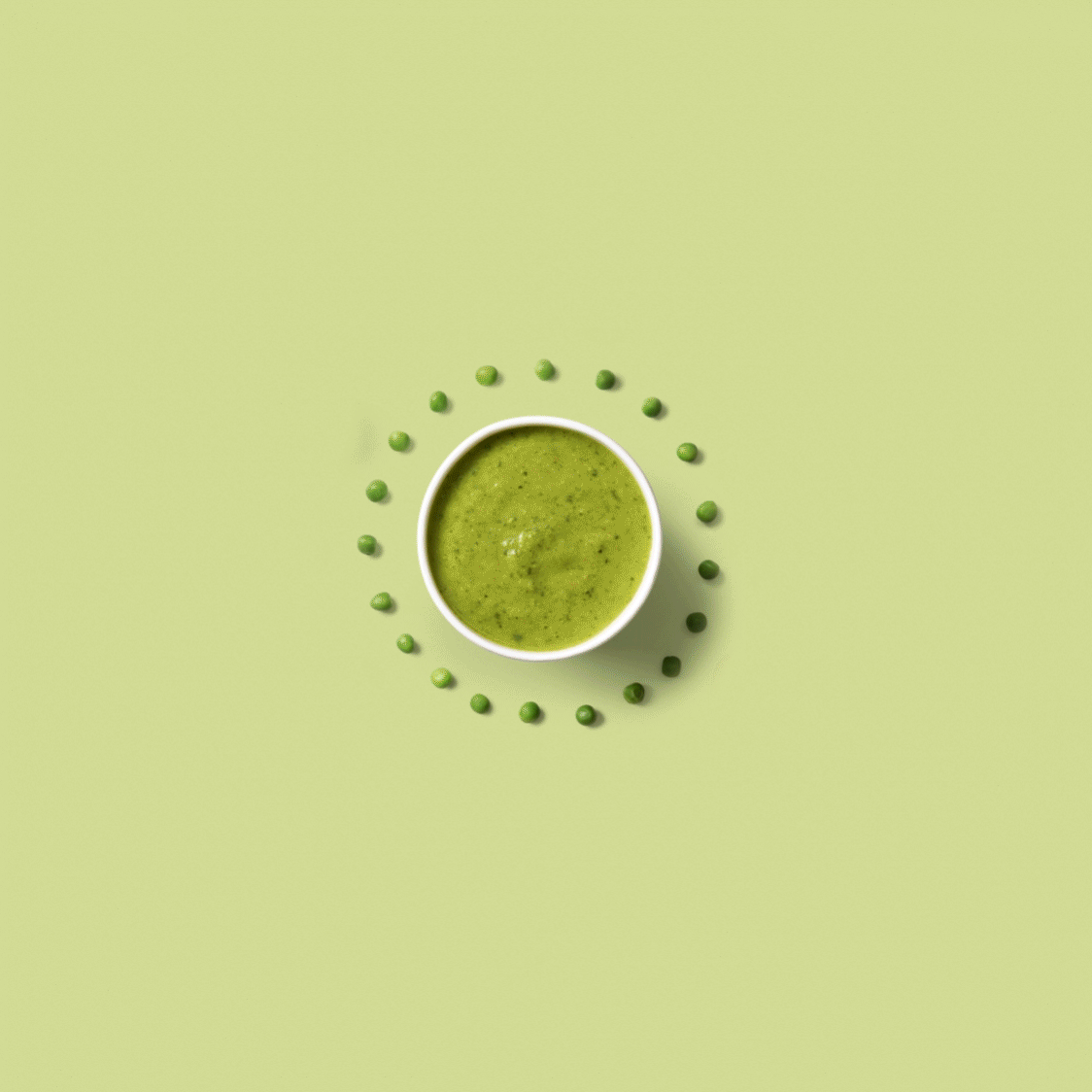
Making illustration and real food photography work well together was a fun puzzle. After some trial and error we found how to make them play well together in a way that felt fresh, appetising and right for Pret.
RESULTS
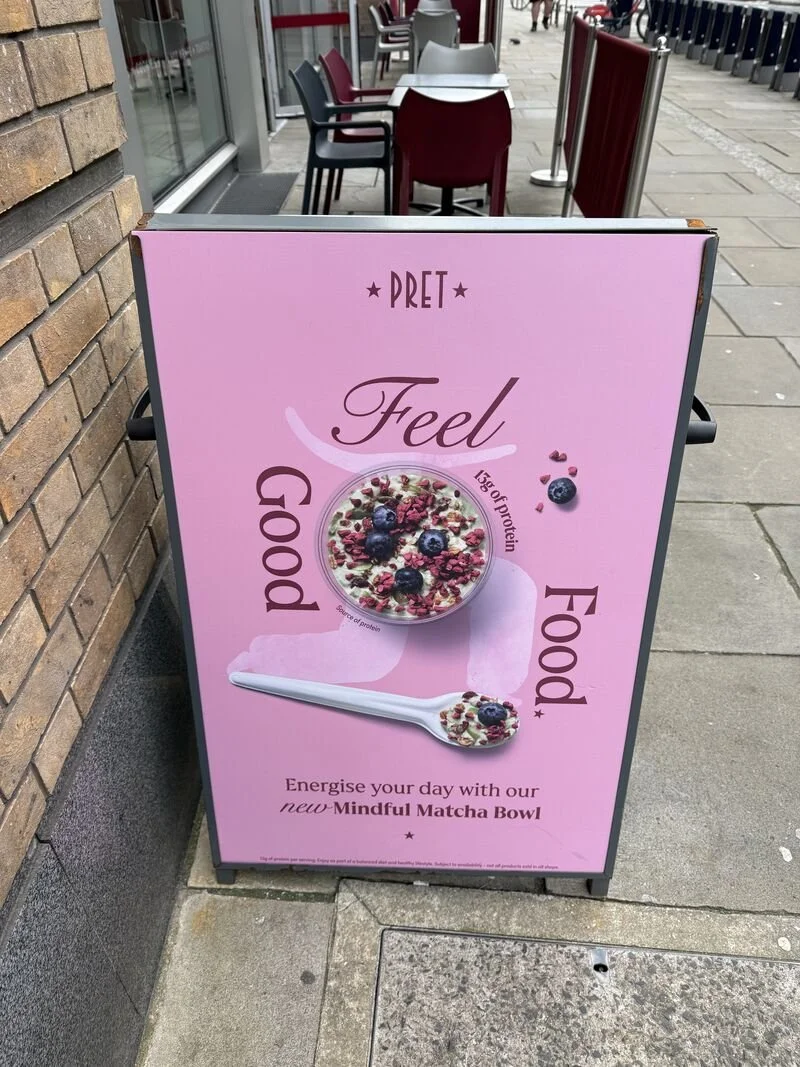
The campaign brought illustration, photography, type and motion together into one clear brand world.
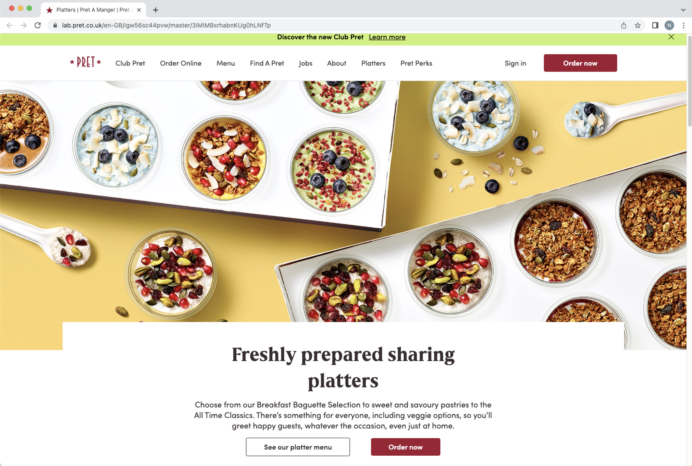
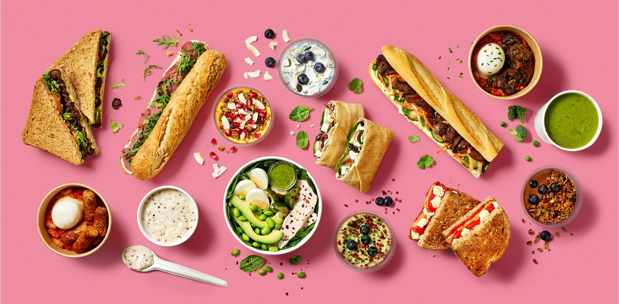
It helped create a more food-first visual direction for Pret, with bright product photography and flexible digital assets that could work across CRM, social, delivery, app, web and in-shop screens.
Photography: Jamie Orlando Smith