PAPERCHASE
Reframing eco-stationery for Paperchase
A campaign and product identity for Paperchase, created to give its eco-stationery range a more distinctive and desirable feel.
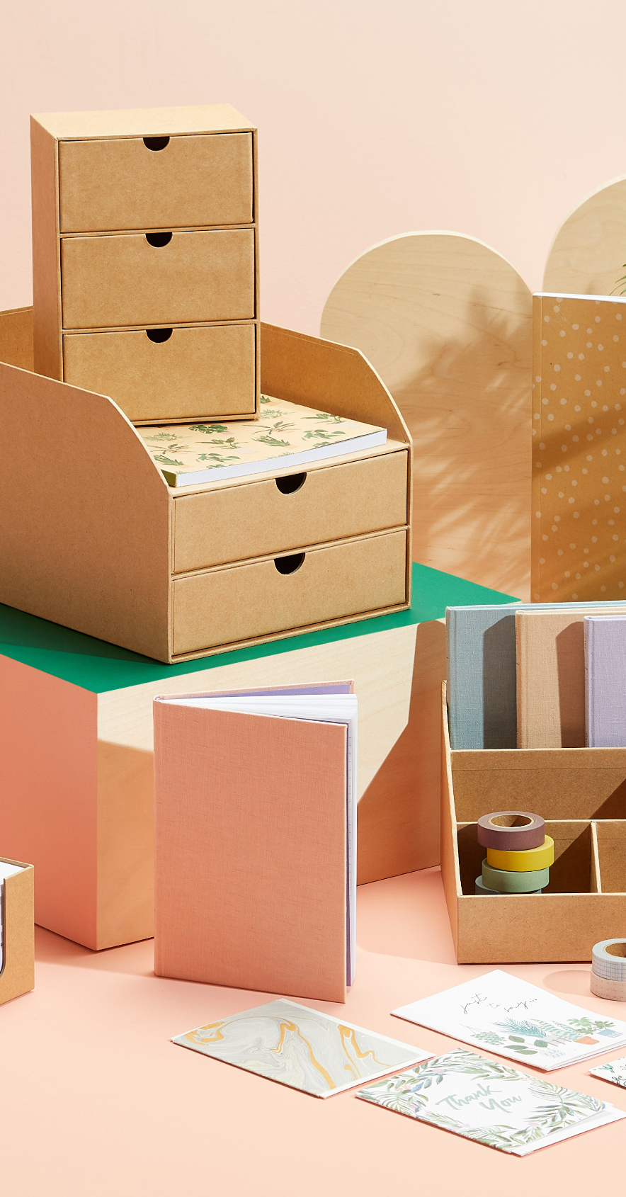
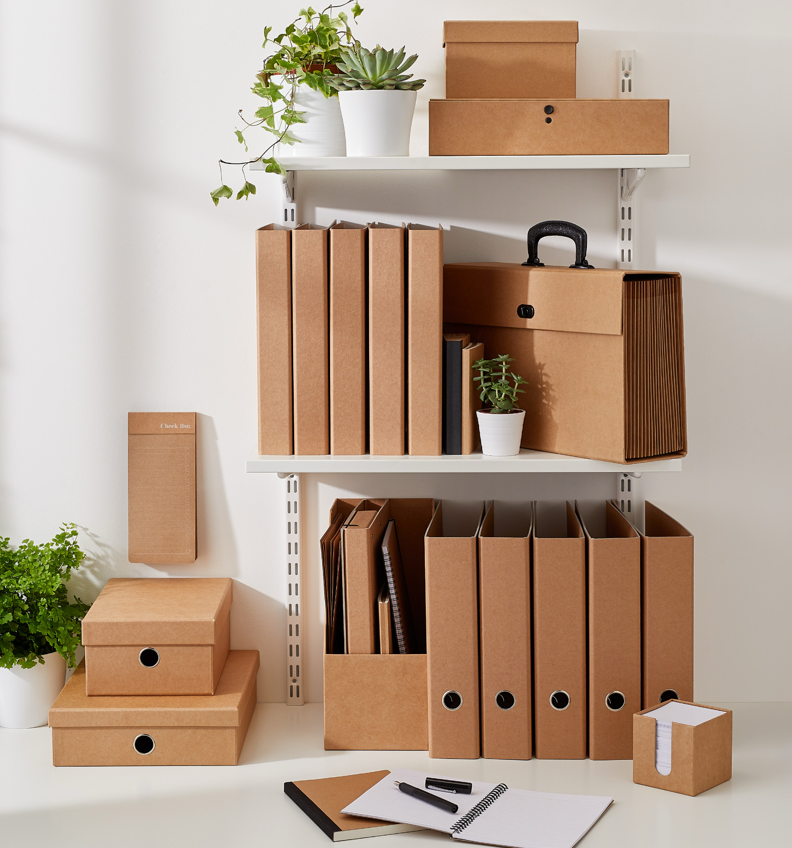
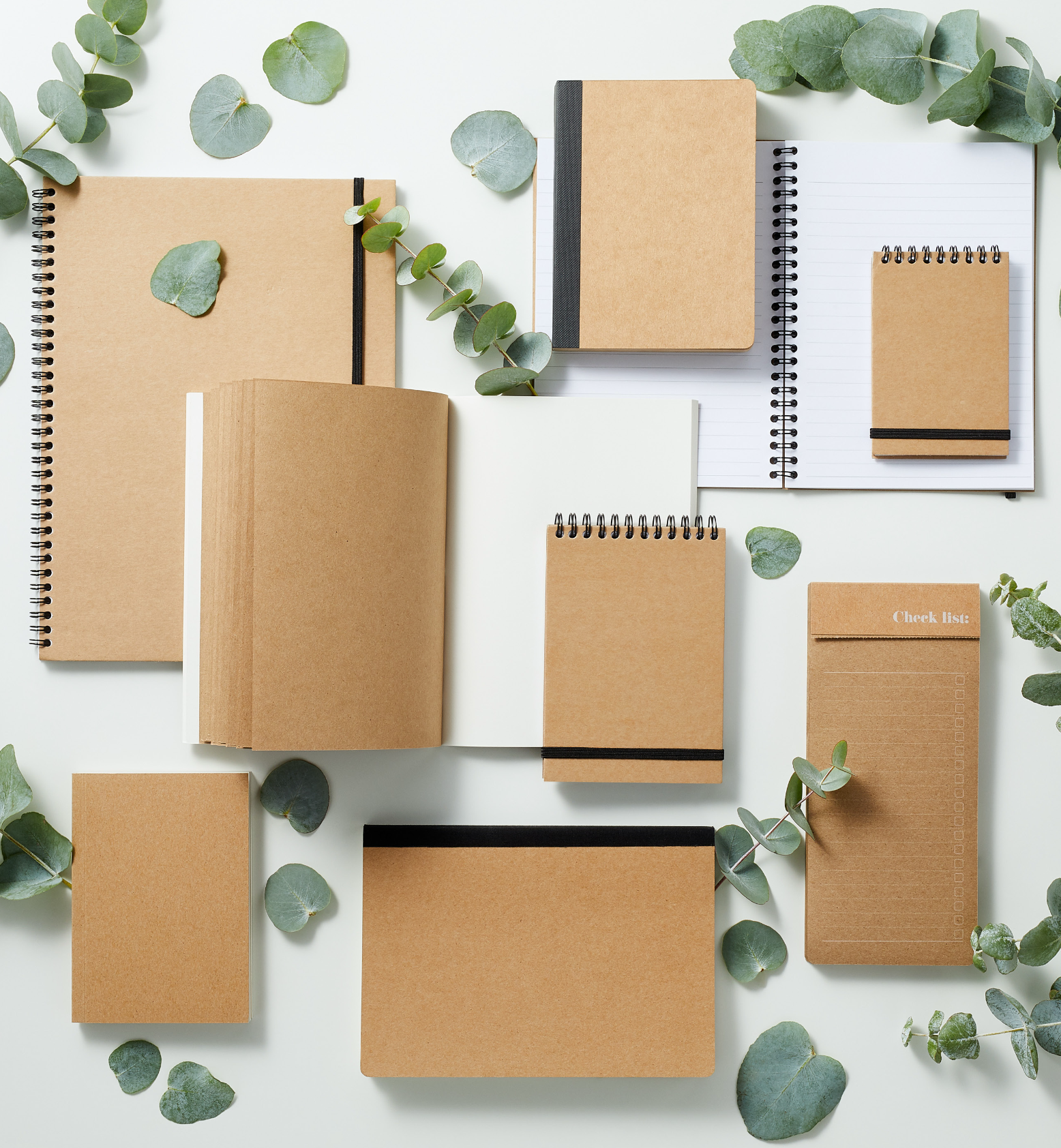
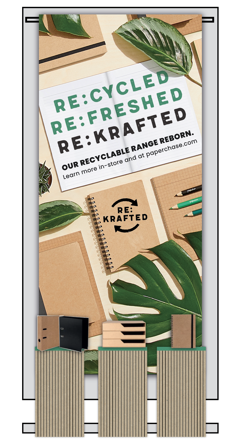
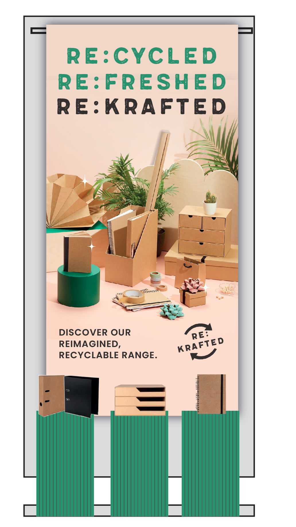
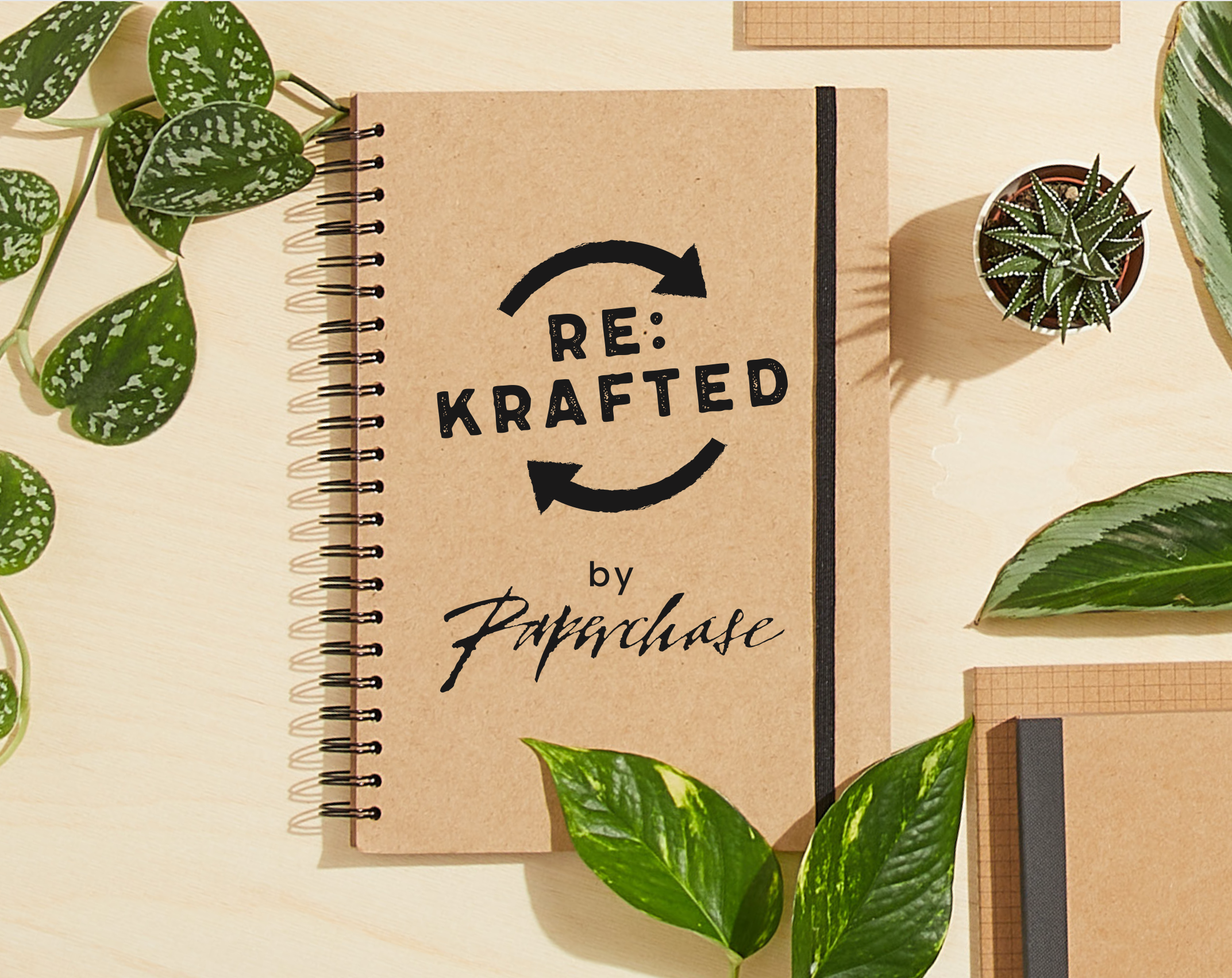
Designs paired bold, stamped typography with a stripped-back kraft palette, which helped the system connect the products to the wider sustainability story.
MY ROLE
————————
I designed the campaign’s entire visual identity across product, packaging and retail touchpoints, shaping how the range appeared both on-shelf and in-store.
I then oversaw rollout of the campaign’s product graphics, campaign messaging, POS, display concepts and art direction across both digital and retail.
CHALLENGES
Making recycled stationery feel considered and giftable, while keeping its natural, low-waste character, came down to the materials. They didn't always print cleanly, so I leaned into design elements that played to their strengths.
To achieve this, I balanced a stripped-back kraft palette with confident typography, natural styling and simple messaging that gave the range more personality.
RESULTS
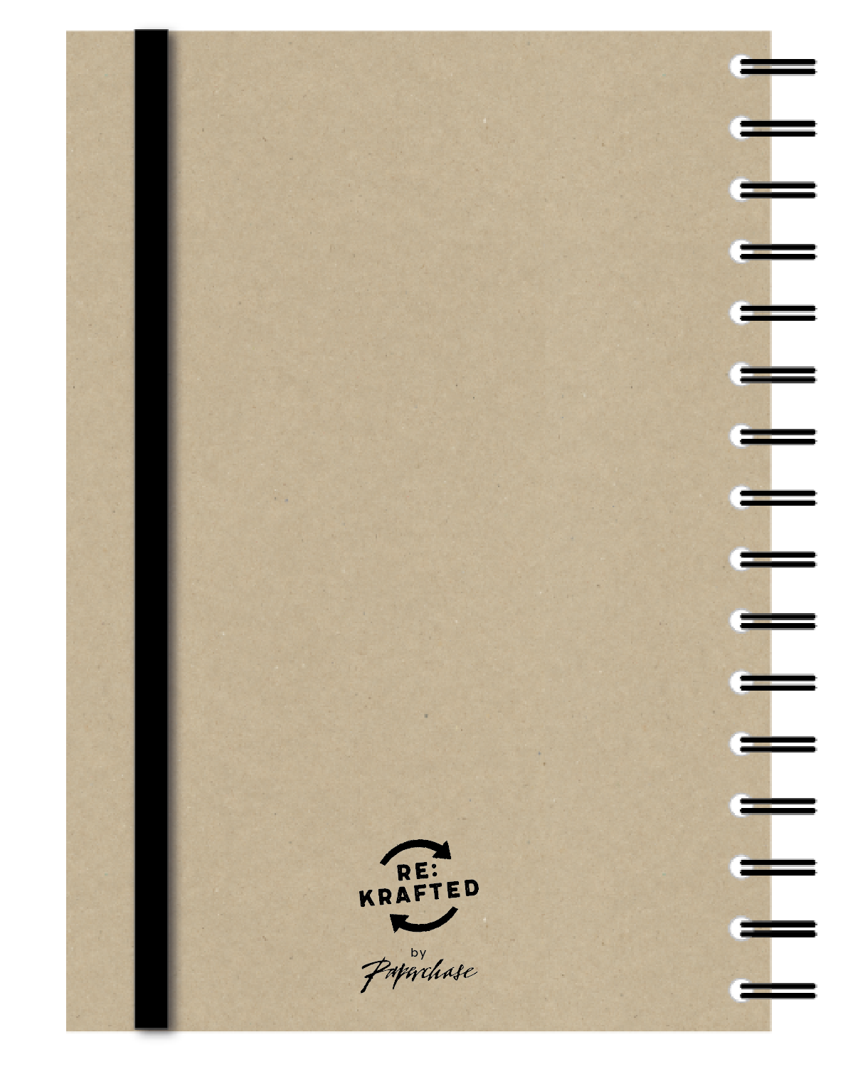
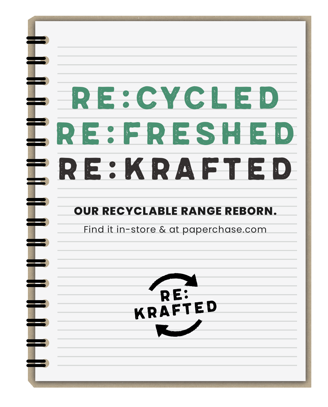
The campaign adopted a “Re:” branding pattern - Re:cycled, Re:freshed, Re:krafted - to give the range a stronger voice and a more memorable shelf presence. Paired with stamped-style typography and tactile recycled materials, the creative connected the product design, packaging and in-store messaging, without overcomplicating the idea.
The final work gave Paperchase’s eco stationery range a clearer, ownable and more premium identity.