TBWA L&D
rebrand for print, digital and email
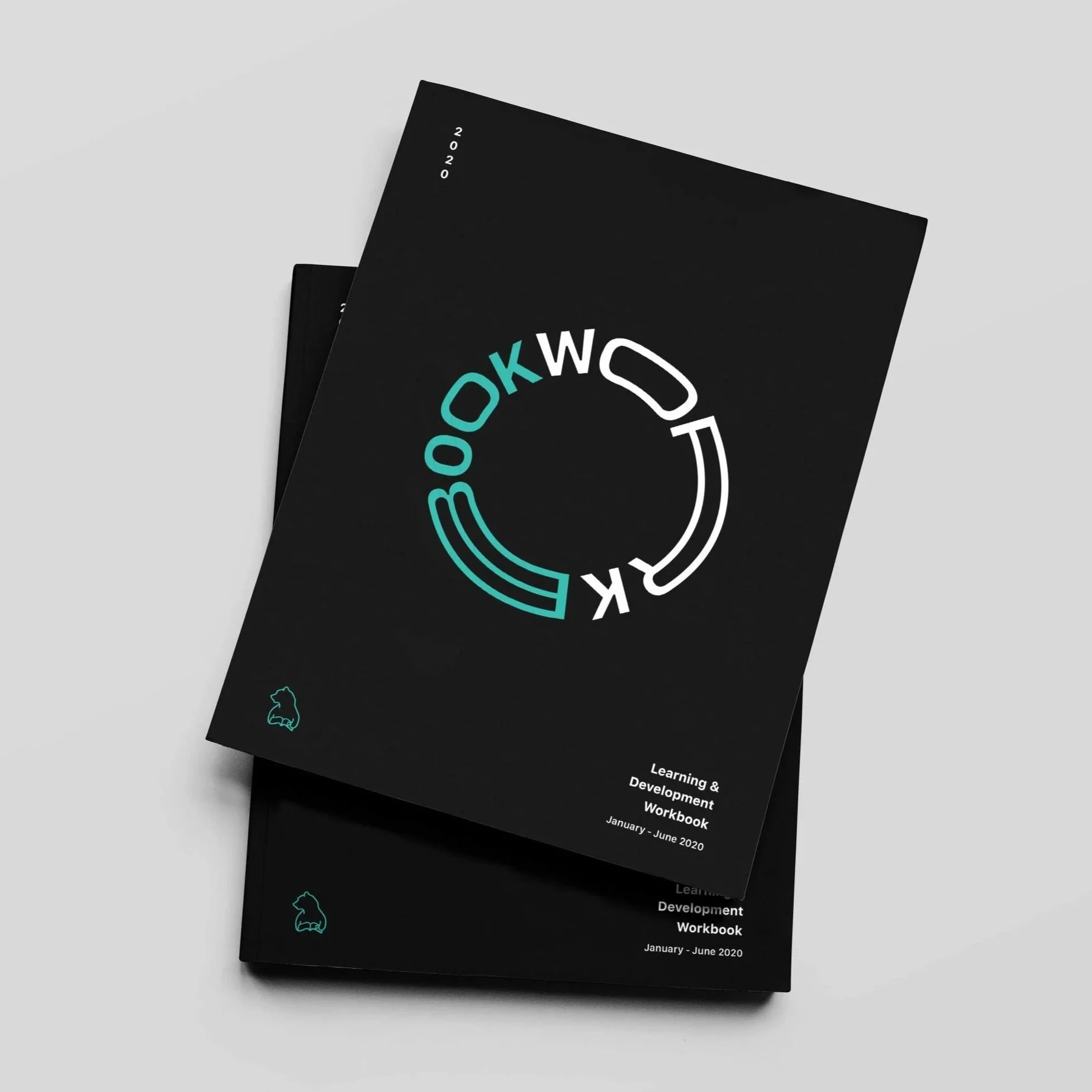
A learning and development rebrand for TBWA / Media Arts Lab, created to make internal communications feel clearer, warmer and more engaging.
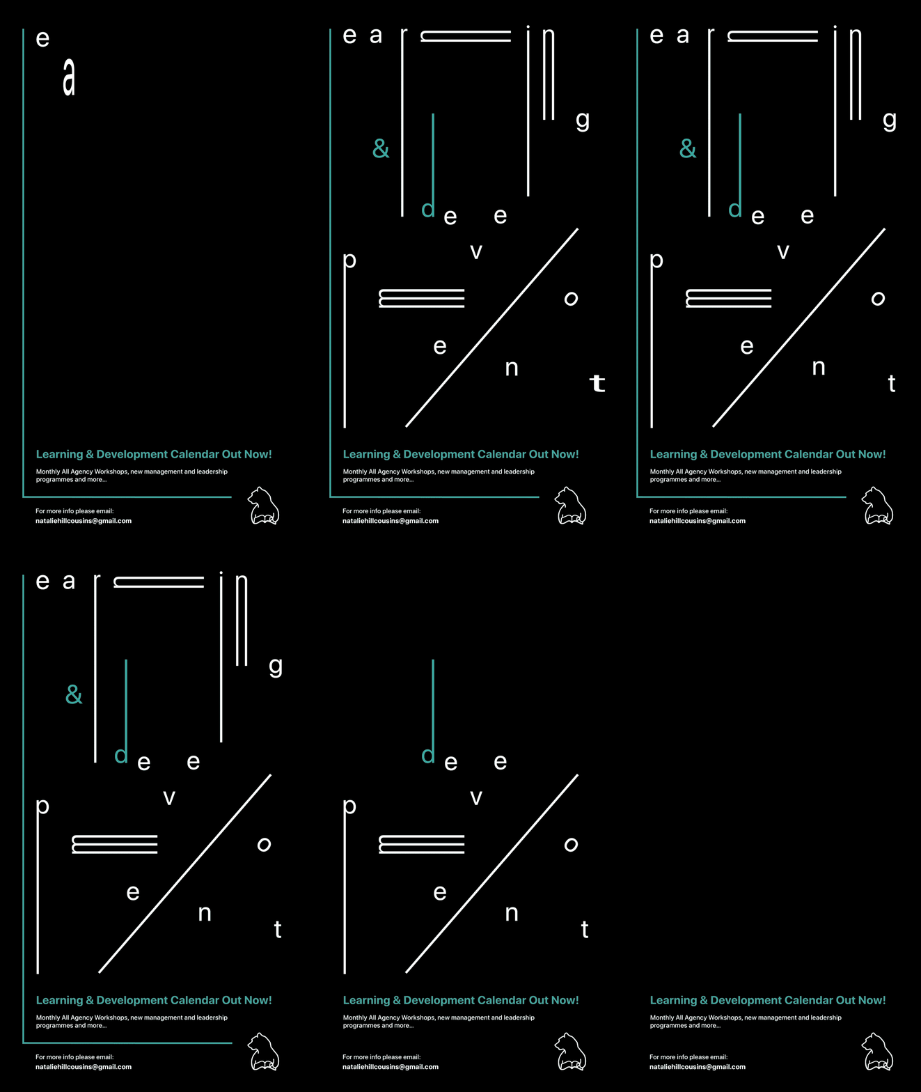
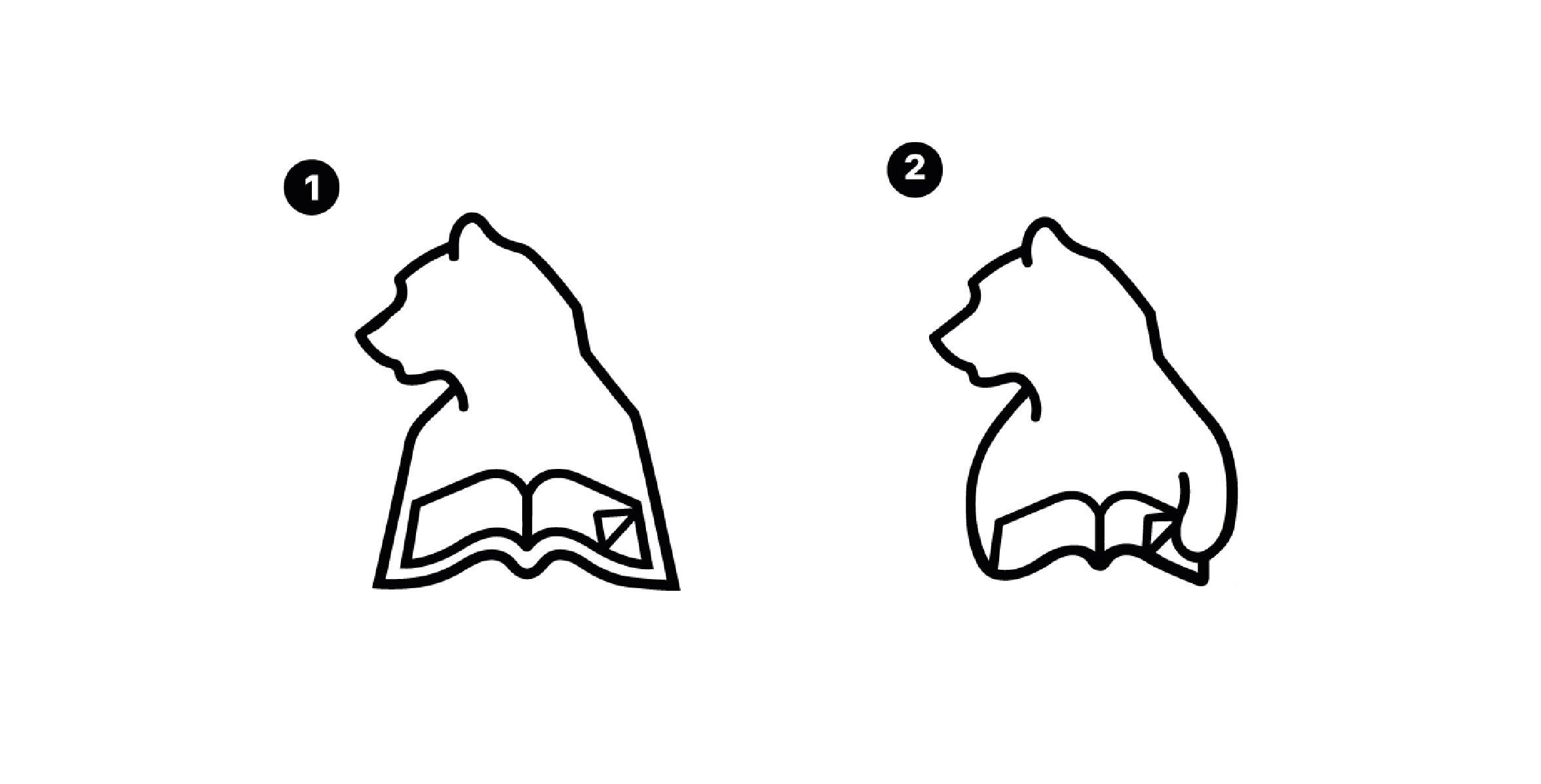
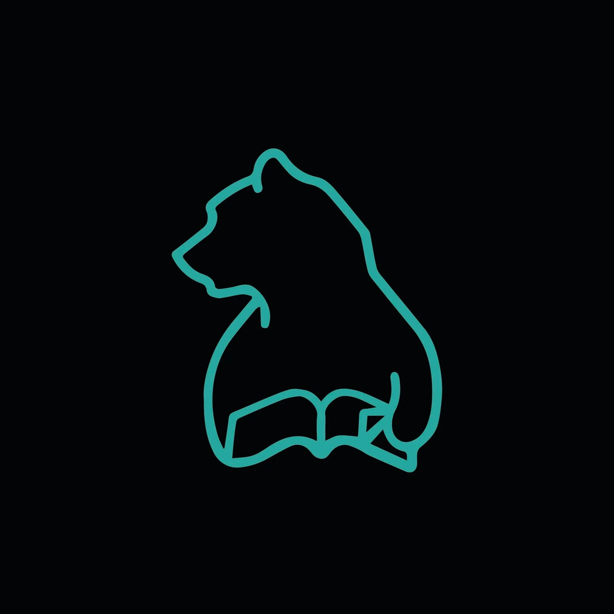
The work reimagined the MAL bear with a book motif that subtly nodded to the TBWA logo, turning it into a flexible identity for workbooks, posters, email comms and screen-based assets.
MY ROLE
————————
I proposed, concepted and coordinated the work, creating a consistent identity that could flex, and delivering print, digital and email designs for the team’s learning and development touchpoints.
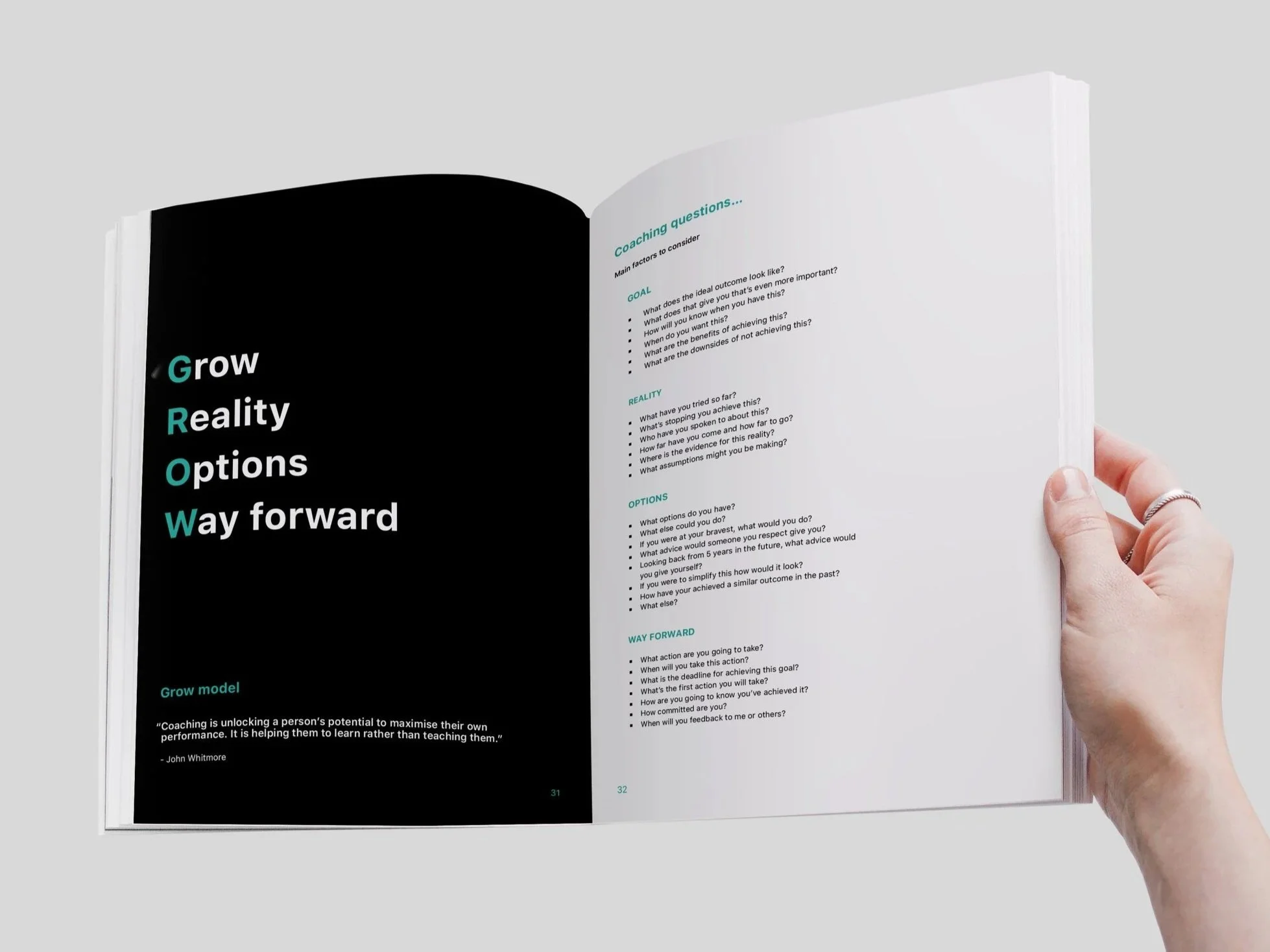
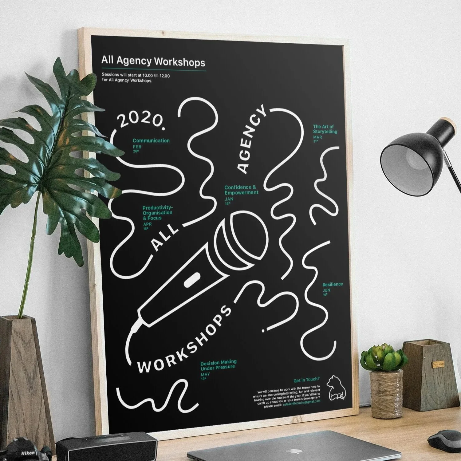
This included reworking the bear logo, illustration, layout design, poster concepts, workbook design and animated digital assets.
CHALLENGES
Some of this material was text-heavy, so I planned layouts carefully and chose design elements that earned their place beside the copy - keeping everything useful, engaging and clear.
The system needed to feel professional, but still have enough personality to make workshops, training content and email communications feel more approachable.
RESULTS
The final identity gave the learning and development team a clearer and more recognisable communication style.
By combining bold typography, simple illustration and flexible layouts, the work helped make internal content feel more considered, cohesive and easier to engage with.