Ohk! beauty
Beauty branding with character
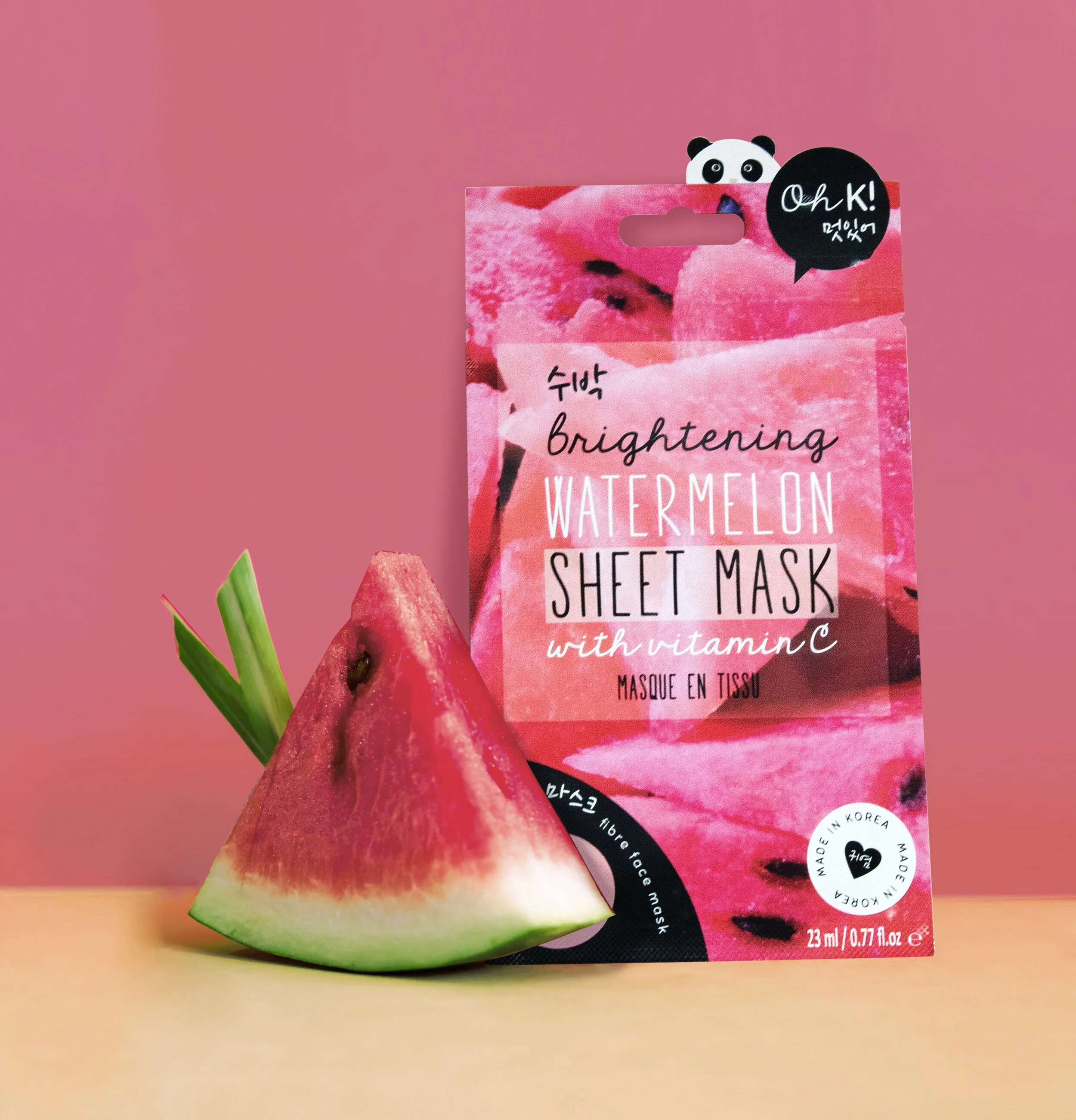
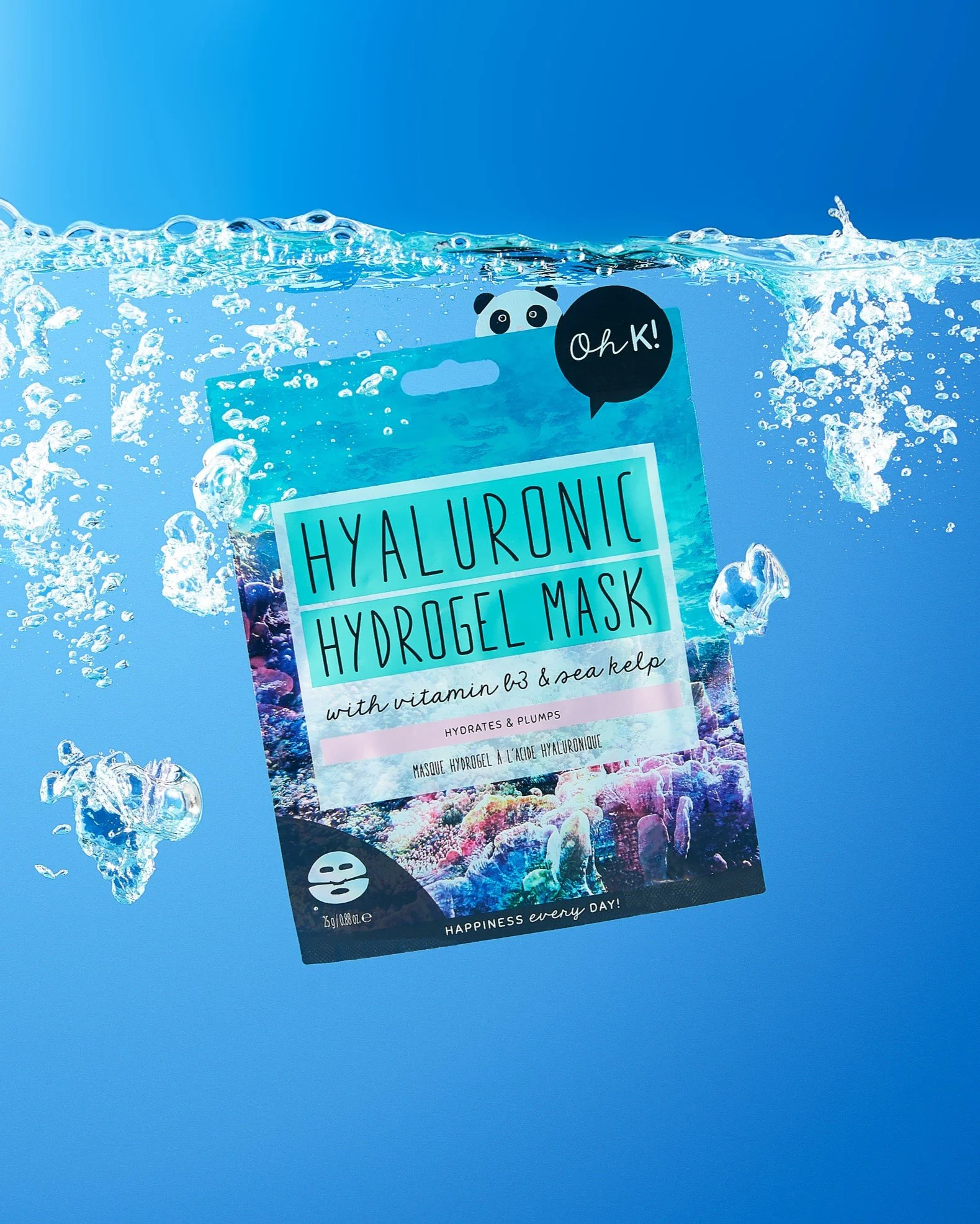
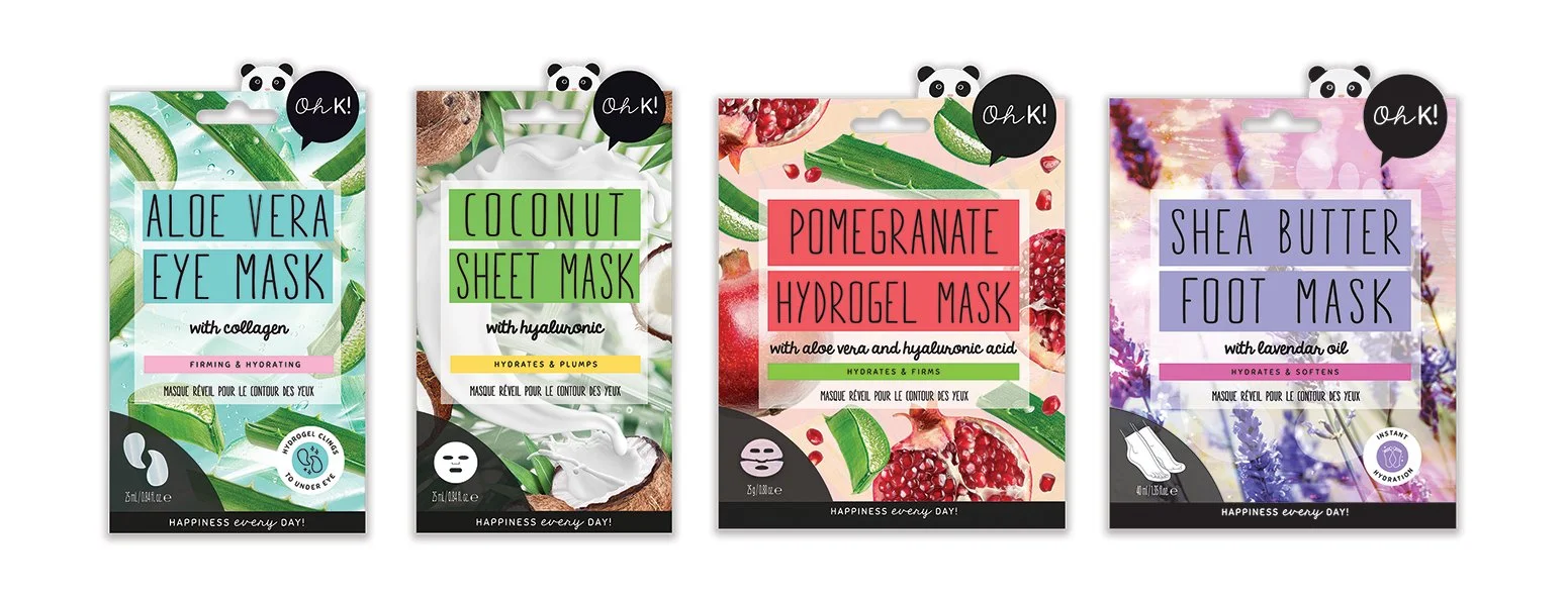
A colourful beauty project for Oh K! Beauty, created to bring more personality and consistency to its product world.
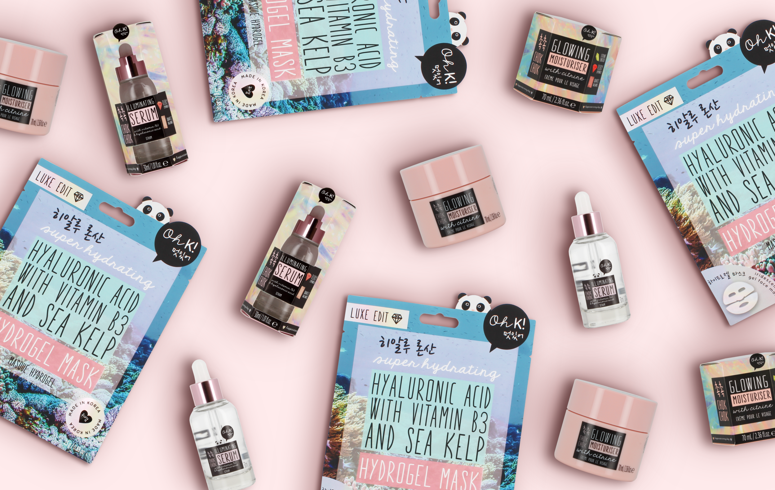
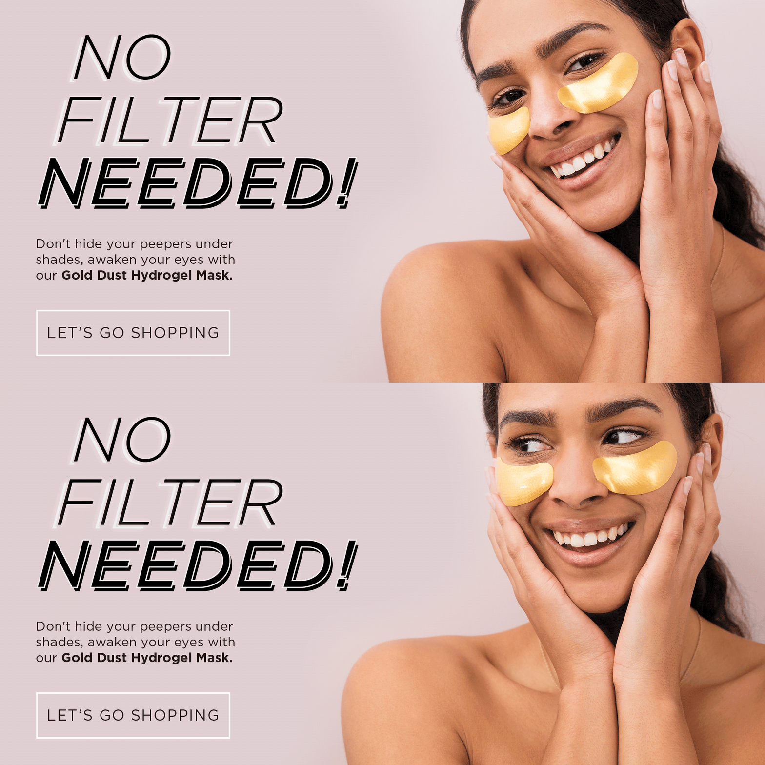
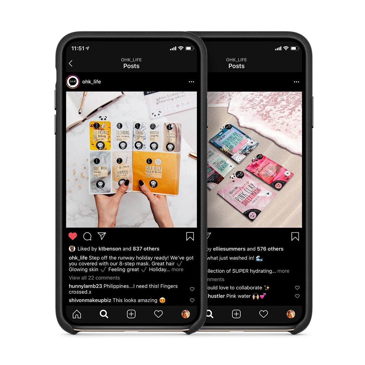
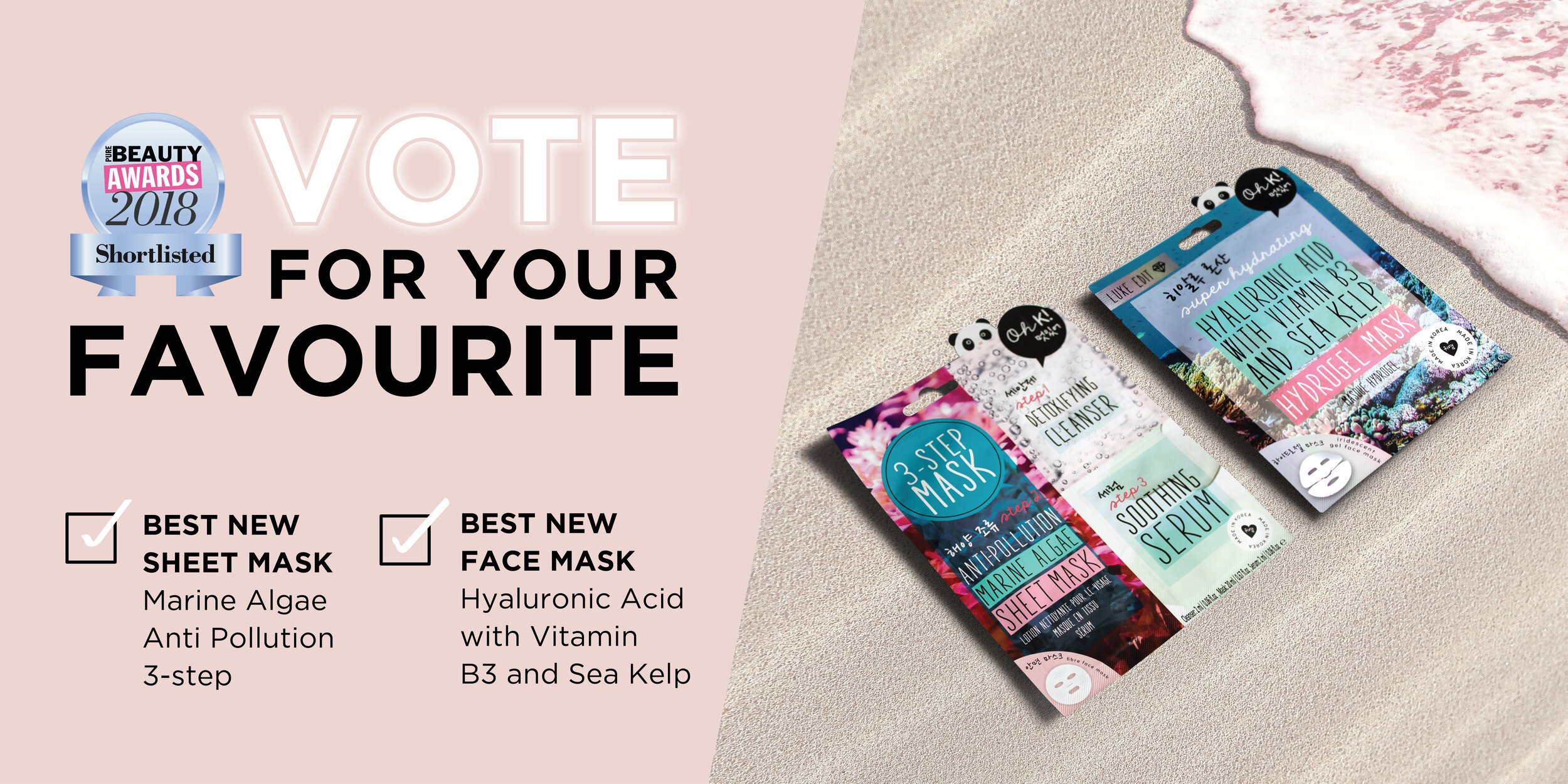
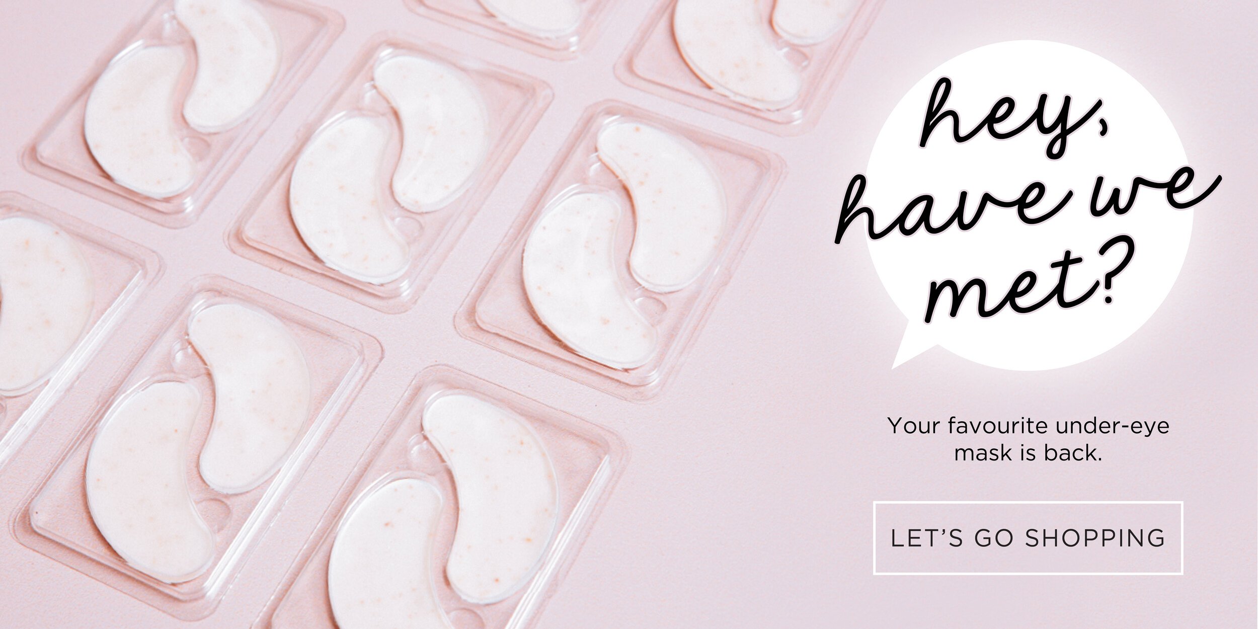
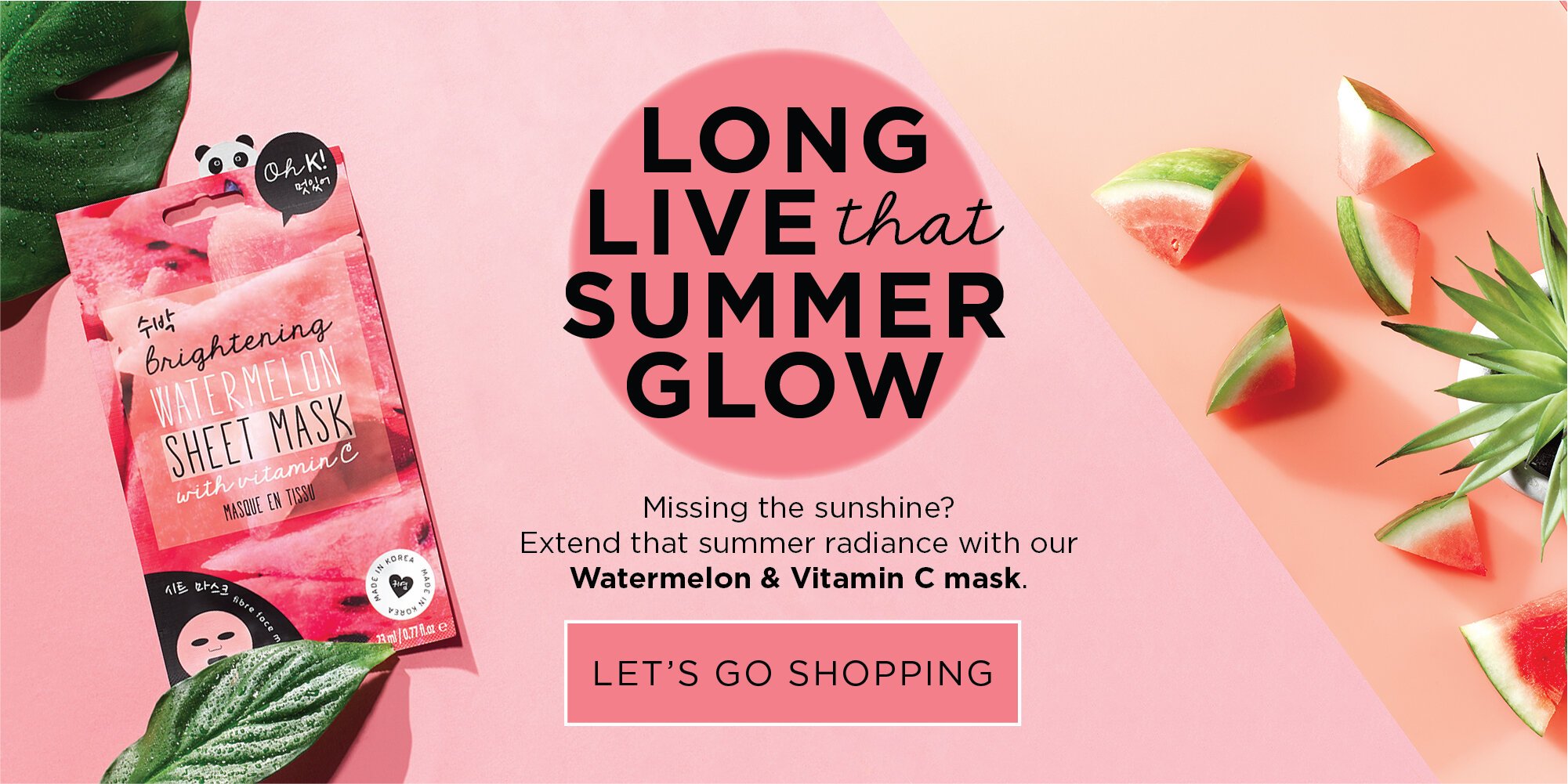
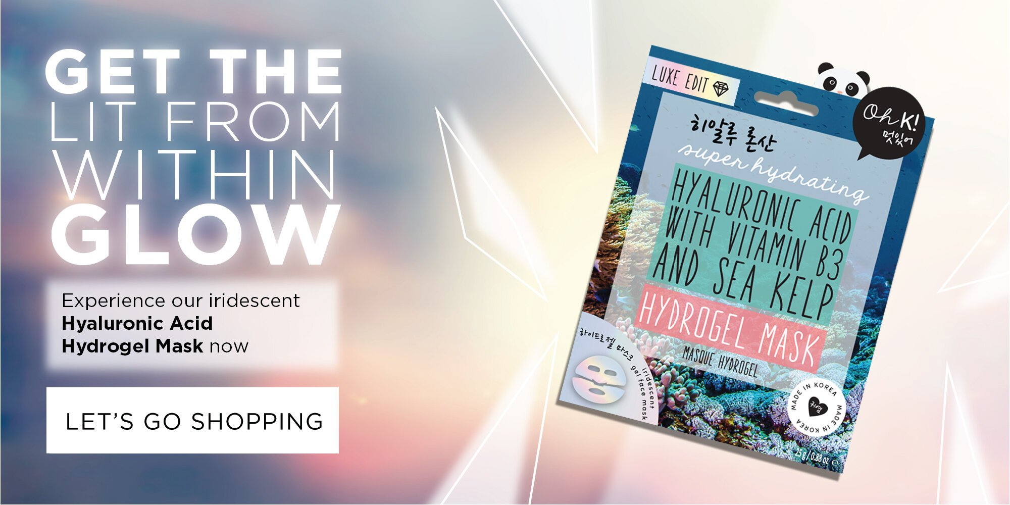
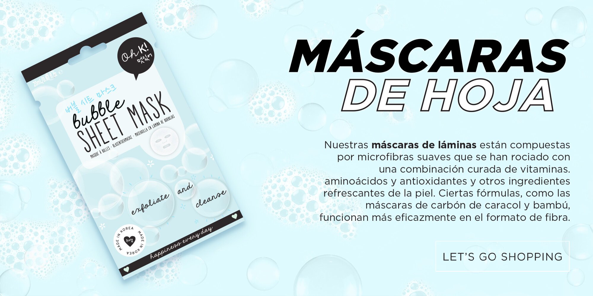
The work spanned packaging, illustration, icon design, digital banners, social assets and promotional visuals, helping shape a playful look that could flex across product ranges and online channels.
MY ROLE
————————
I helped shape the overall look and feel across brand, packaging and digital, in collaboration with my creative director.
This included developing graphic elements, creating icons, designing campaign assets and adapting product visuals for web, social, email an promotional use.


CHALLENGES
Creating a look that could stand out in the saturated Korean beauty space was a learning curve. The time I spent researching the space inspired the cuteness, colour and character that ended up being at the heart of the creative.
Each asset needed to feel charming and trend-led, while still being clear, polished and flexible - across packaging, digital and promotional formats.
RESULTS
The work helped shape a bright, character-led product world that could stand out on the shelf and translate across packaging, digital and promotional touchpoints.
I worked for Oh K! when they were just getting started, but they have since grown into a recognisable K-beauty brand, stocked by major retailers across the UK, Europe and North America.